
Interior Design is a newly found interest for me. It all started on Pinterest, where I would pin photos of cute and minimalist-designed rooms onto my INTERIOR DESIGN board. From then on, I've always looked for great interior designs online and try to get ideas that I can use to beautify our home even in the simplest ways. So when my friend, Jairus, a Philippine School of Interior Design (PSID) student, invited me to his and his batchmates' annual exhibit, I didn't hesitate and grabbed the opportunity to see amazing and eccentric interior designs. I was sure that it would be a feast for my eyes, and it didn't fail me.
Every year, the students of PSID hold an exhibit where they showcase their own interior designs. The students were divided into groups with 4-6 members and their professors assigned them a country which served as their inspiration for their respective designs. The students had to make a very thorough research about their country's history, traditions, customs, and famous places. They would use the information they got to explain to the visitors the rationale and inspiration behind their design. I was very impressed by how much detailed their research was!
The exhibit for this year was called GLOBALSCAPES.

There were 22 countries, meaning their were 22 exhibits. I love this flight board because it really gives the feeling that you're about to travel worldwide!
There were 22 countries, meaning their were 22 exhibits. I love this flight board because it really gives the feeling that you're about to travel worldwide!

Before visitors entered, they were given a voting slip where they would list their top 3 favorite exhibits. I voted (1st) Peru, (2nd) United Kingdom, and (3rd) Brazil.
PERU
This is the Peru exhibit, one of the students who designed this was my friend, Jairus. I really love the stone wall around the television. It gives off a nature-y vibe. According to the student who was explaining, they got the idea from the place where a famous Peruvian feast takes place yearly. I also love the colors of the sofa and throw pillows. It was a nice combination.

This string wall made of colorful yarns was really striking! Jairus told me that many people said it was their favorite part of the Peru exhibit, and I couldn't agree more!

Behind the sofa and the string wall is the study area. I love the white desk because it makes the area look clean. The design of the cabinet doors are lovely too, really Peruvian! I also like the corkboard and the design around it.

What I really like about this exhibit is not only did they use designs inspired by a famous Peruvian place and selected Peruvian colors, they also made the study area a level higher than the living room. It really looks good and makes the whole exhibit more sophisticated.

Overall, I like the simplicity of this exhibit and the colors they used. They used designs inspired by a famous Peruvian place and selected colors that give off the Peruvian vibe. You could really see the Peruvian aesthetics in each corner.
UK
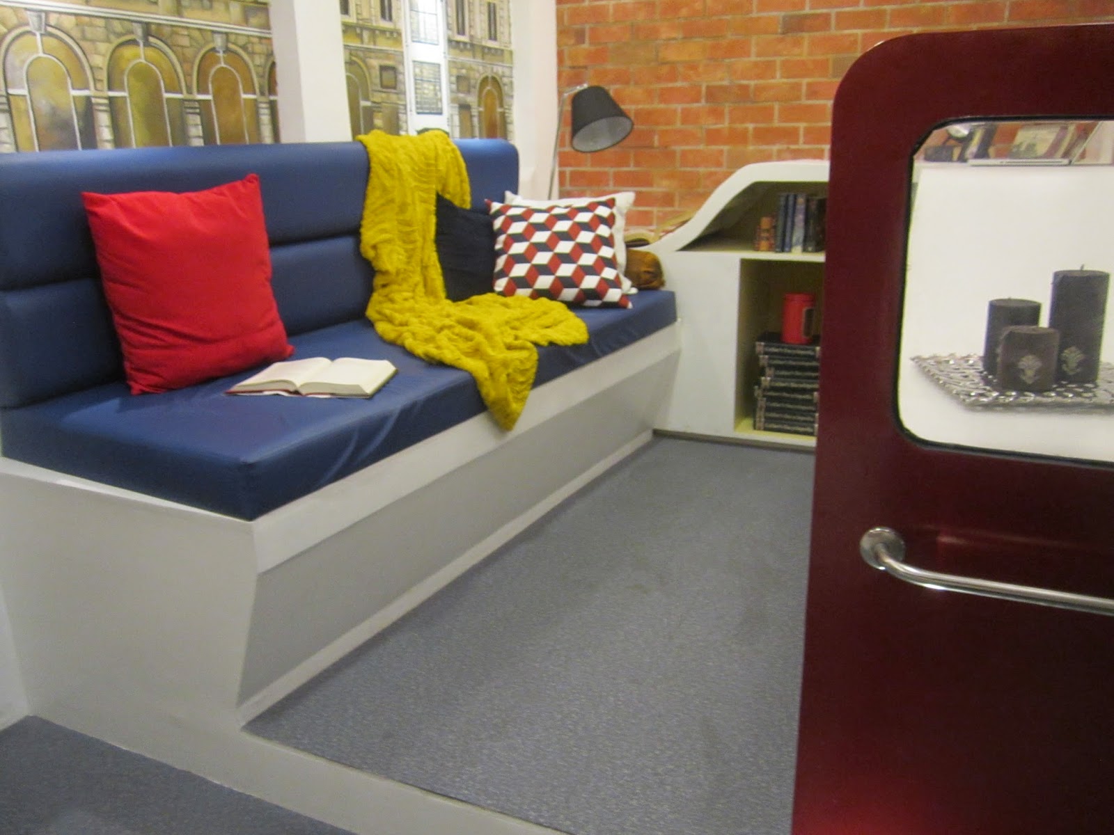
I literally gasped in awe when I saw this bus-inspired design. We all know that UK is known for their buses, so the students used it as a part of their design and it was an extremely creative idea.

So this is the inside of the bus-inspired reading nook. There's a sofa, throw pillows, a lamp, and bookshelves.

Beside the reading nook is the living room. I really love how they used an actual tire for the bus! Their wall is red brick-inspired because UK is also known for that. And of course there's this minimalist imitation of the Big Ben. I love the pattern around the clock.

And for the telephone, well, they used a mini table designed like a mini telephone booth! When we think of UK, we cannot forget the red telephone booths, right? I really loved this furniture I actually wanted to take it home!

What I loved about this exhibit is their use of the things UK is really known for: bus, red-brick walls, Big Ben, and the red telephone booth. How much more UK-ish can you get than that?
BRAZIL
Like UK, the students for the Brazilian exhibit made use of a thing their respective country is known for. In this case: FOOTBALL. They designed an outdoor room where families or friends can gather to have a drink. And what's really amazing? They designed the parameters of the room based on a soccer ball! Instead of having the usual square room, they constructed a distorted round thing that looked like a football. They used acrylic instead of glass because the latter would make the whole thing heavy. I really love the transparency because when you place this in your roofless garden or backyard, you'd see the raindrops fall on it when it rains and I think that would be a good sight to see. I love the lights too!

So there are sofas on each side and between them is a black and thin pathway that has the same patterns of the acrylic football. I love the lights under the sofas, they make the whole thing look and feel like a real bar.

As you can see, the colors of the throw pillows are the same as the colors of the Brazilian flag. I love the indoor plants too because they give a homey feeling.

This is how the whole thing looks like! Awesome right?

This is how it looks through the acrylic from the outside.

I love the Brazilian exhibit because it's not just a room, it looks like an art installation too. Very creative.
I'm very much in love with this exhibit. It was a great experience and to be honest, I can't believe they were done mostly by students who have the same age as mine! They did everything from research to execution. They have my respect. Also, thanks to their awesome sponsors who helped them out! Without their sponsors, this exhibit wouldn't be as great as it was.
Everything in the exhibit is for sale/auction.
I actually took photos of all the exhibits, but this post would be too long if I talk about them here as well. So I'll just make another post about my other favorites from the rest of the exhibits.

No comments:
Post a Comment